Hi, I'm Huyen
Our work (and this site) is devoted to sharing ideas, tools and resources that will help you automate, grow and scale your practice.

You started your online practice a while ago and may now be wondering why sales are not as good. This is something I hear quite regularly from my clients.
Do you know that users now spend more time on their mobiles than their laptops?
According to eMarketer, the amount of smartphone users is expected to exceed 1.76 billion worldwide by the end of this year, up a massive 25% from 2013, and by 2017, more than one third of the world’s population will be smartphone users.

Source: http://blog.getresponse.com/designing-perfect-mobile-landing-page.html
That trend is getting stronger each year, so if most of your website traffic is coming from mobiles, you need to ensure that your mobile landing page is designed for optimum performance and conversion.
Mobile landing page here I am talking about product landing page on ecommerce website so to speak, I will write another article for services provider websites separately.
Mobile design is all about trade-offs
One way to look at mobile design is that it’s essentially about constraints (things you have to do and things you can’t do) and tradeoffs (the less-than-ideal choices you make to live within the constraints).
The ideal is to be selective and choose the best elements to show on your mobile landing pages.
Here is a list of 13 elements that you should pay attention to increase the sales on your mobile landing page
1. Buy Now, Call Now button stays floated the whole time
Wherever users scroll down or up on the site, they should be able to access the “Buy Now” and “Call Now” button to enquire or buy your products. You should make it easier for them when shopping.

Image 1: Toyrus has floated “Add To Cart” button wherever you scroll on the mobile landing page
2. Good quality product images and showing products in context, action
We all know that a picture is worth a thousand words. Did you also know that the brain processes images 60,000 times faster than text?
All of this is a long-winded way of saying images on your home page are very important. So don’t skimp on them.
Show products from different angles. Provide a zooming facility so users can zoom in on every little intricate detail. If appropriate, show the product in context.
Modcloth is a great example of best practice in this area, notably showing the product in context (on mannequin vs. flat) and video on a person.

This example from Danskin shows how you can view the front or back of this product in any of its 4 colours:

Scene 7 is another great example, launching its products in a popup window with an option to enlarge or shrink, or zoom in on a particular detail.

3. Be detailed about the value proposition or product benefit
One of the best ways to advance your value proposition is through a list of benefits. Many landing pages use an unadorned bullet point list to explain the benefits of their product or service.
Benefits should be clearly focused on the users.
Up to 50% of potential sales are lost due to inadequate information, says IDC, a global research website.
Most sites that I evaluate do not provide enough information about the products or services they sell.
Let's take this chair screenshot below for example. If I describe it like this (all true facts):

Would you pay $940 based on what I just listed?
Of course not. Yet so many sites do exactly that. They just list several bullet points with features (not even a detailed list) along with the price.
The most effective sales technique is to add as much information—text, specifications and videos—as possible.
It's true that 79% of people won't read it all, but 15% read everything! That 15% is your main target group.
You need to provide enough information so that the prospect can convince themselves. That might require a lot or a little.
Add pictures, videos, reviews to all of your products. Smart, neutral and benefit-oriented sales copy works the best.
Take a look at Amazon—it manages to create a lot of content for most products it sells, and it sells millions of products.
First communicate the value, then list the price. Otherwise people might make a snap judgment just based on the price and not care about the value it offers.
4. Add Product reviews/ testimonials to your product pages
Checking product reviews prior to purchasing is now such standard practice by purchasers that it would be commercial suicide for retailers to ignore.
Research shows:
70% of purchasers consult reviews or ratings before making a purchase(PeopleClaim)
63% are more likely to buy from a site if it has product reviews
67% of consumers read up to 6 reviews before they feel the store is trustworthy enough to buy from. (MarketingProfs)
79% of people trust reviews as much as personal recommendations
80% of people have changed their mind about purchasing something as a result of a bad review. (ReputationAdvocate)
Convinced yet? You need to get onto this. Need more proof?
Look at how MVMT Watches uses (and solicits) reviews on their product pages to convince people to buy. http://www.mvmtwatches.com/collections/frontpage/products/black-tan-leather

5. You need a Guarantee
Customers love guarantees – it is like a safety net in case anything goes wrong and this happens all the time.
A guarantee, regardless of what it is or how it’s presented, can help people feel reassured while on your landing page.
Simply the word itself improves the likelihood of a conversion, such as “30 Refund Guarantee – No Questions Asked”

Example of hipkids.com.au 1 year guarantee and 30 days money back guarantee

Image 2: Example of 30 Days Full Return policy of zanui.com.au
6. Clear Shipping, Return, Exchange policy information
When it comes to online shopping, users care about how they can get the products safely and cheaply. They want to be reassured that they know what to do in case something goes wrong.
Your task is to make sure that you answer all the questions about payment, shipping, refund, and exchange policies that prospects might have.
You can go a bit more detailed about the options that users could have, for example, Pottery Barn Kids gives shoppers a detailed cost of 3 delivery packages - small parcel, standard and deluxe corresponding to 3 types of destinations, Metro, Regional and Country.
It also provides a different delivery time corresponding to a specific area.
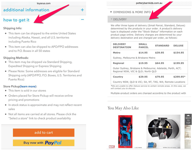
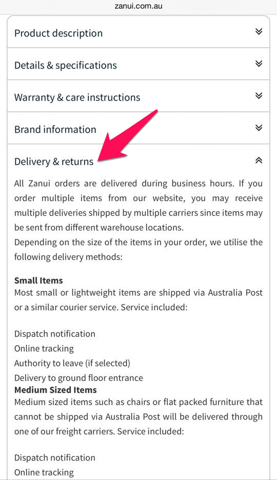
Image 3: Example of zanui.com.audelivery and returns
7. Live chat tool available for questions
Here are 5 obvious benefits of Live Chat
- It’s convenient!
Everyone loves a live chat help expert. They provide immediate access to help. Wait times are often far less than call centre wait times, and potential consumers can easily work on something else while they wait.
Almost half (44%) of the online consumers contacted for a study called Making Proactive Chat Work by Forrester Research said that having questions answered by a live person while in the middle of an online purchase is one of the most important features any web site can offer.
- It’s cheap!
Live chat reduces call centre costs because live chat representatives can handle multiple chats at one time.
- It increases sales!
By having someone on hand who can immediately walk a customer through a sales transaction, should they need help, stops them from abandoning their shopping cart and walking away from the sale.
- It gives you a competitive edge!
A recent study by TELUS International (http://www.telusinternational.com/online_chat_study) found that few top retail businesses offer live chat support. This is an opportunity for you to gain a competitive edge over your competition.

Image 4: The “Chat Here” box is always present, regardless of scroll depth, on FotoZap’s landing page
8. Make your products irresistible with attractive offers
Let’s think about the type of offers that would encourage users to buy provided that everything else about your product is good.
Users have a lot of excuses not to buy your products.
“Oh, I might wait to see if there is any better product out there.”
“Well, there might be some sales off promotion soon, maybe I should wait?”
There are lots of “ifs” and “buts”, your job is to get them buy now otherwise the offer won’t be there forever.
Here is an example:
10% off for the first time buyer and FREE shipping for returned buyers – This offer is gone in 47 hours 34 mins (with count-down clock)

Image 5: au.iherb.com encourages buyers to buy more than one items by offering attractive price for two item purchase, giving buyers an irresistible extra savings.
9. Make sure that your site has high payment security
Forbes Magazine,states that an average 30,000 new websites are hacked every day. Many of these sites are legitimate small businesses that distribute malicious code, to other sites, without even realising it.
It is your responsibility to make your potential customers feel safe when buying your products.Here’s what you can do.
- Use SSL certificates and ensure PCI compliance
Every webpage on your site that deals with secure data must be SSL (Secure Sockets Layer) certified and your payment gateway must be PCI (a set of industry standards for merchants who process card payments) compliant.
- Acquire a "Google Trusted Store “badge :
This will help prospects’ trust your site and your products. You can sign up for 'Google Trusted Store' accreditation, which takes 30 to 90 days for the assessment;
https://www.google.com.au/trustedstores/for-business/
Examples of Google Trusted Store:

10. Offer cross-browser, device shopping experience
Users tend to browse on mobile and then finish the purchase on a desktop.
You should offer buyers the option to remember the browsing history on multiple devices so they can continue from where they left off on a mobile, on a desktop.
In the US and UK, about 70% of consumers now use two or more devices daily. Nearly 25% use three or more. And more than 40% start by browsing products on one device before finalising the sale on another.
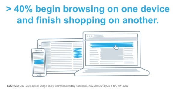
Image 6: Source from atlassolutions.com
11. Give users options to view full site
Some users want to see if they are missing any information on a mobile site by switching the view from mobile to full desktop view. Your website should give them that option.
12. Your site’s loading speed has to be excellent
Speed is everything for the mobile landing page. More visitors will bounce due to poor loading speeds than they will for any other reason.
It is advised that your mobile landing pages are not built using Flash or other plugins that may take an age to load or not even be compatible with your customers’ devices.
13. Offer one-page checkout
When deciding on whether your website should offer a single page or multi-page checkout, put yourself in the shoes of your customer. Which is faster? A single-page check-out will win every time.

Image 7: credit by getelastic.com
What are the advantages of a single page checkout?
Consumers will not tolerate slow loading pages. Having a single page checkout reduces the risk of consumers abandoning the transaction due to page-loading wait times.
With better performance, you improve buyer satisfaction.
Finally – A/B Test Every Element
The only way to be sure that your mobile landing page is working as hard as it can and creating the most conversions is to carry out some A/B testing.
Always start with the major variations such as headline, product images, product description, before refining your changes right down to the CTA (call to action) button copy.
Smart phone use is burgeoning and showing little sign of slowing so it’s important for you to embrace the challenges and opportunities this brings to your practice.
This may require making some changes to your existing website to make it mobile-friendly.
Conclusions
There are 13 elements you need to consider from reassuring consumers that you offer a risk-free and safe shopping environment to having help on hand when required.
Finally you need adequate information and attractive offers. But above all, your website needs to optimised for fast performance from the very start to the very end of each and every transaction.
We live in a ‘now’ world and it won’t pay to make your clients wait. Conversely, get on top of these things and watch the dollars roll in.
What elements on the mobile product landing page that are definitely working for you? I’ve love to hear your thoughts.
Hi, I'm Huyen
Our work (and this site) is devoted to sharing ideas, tools and resources that will help you automate, grow and scale your practice.